Project Initiation
General System & Permissions
Release Notes
January 2026
May 2025
September 2024
June 2024
January 2024
December 2023
September 2023
August 2023
July 2023
June 2023
May 2023
Supplier Management How-To Guides
Supplier Admin & Information Management
Data Governance Dashboard
Supplier Creation
Onboarding Management Plans
Completing Activities
Assigning Classifications to a Supplier record
Issuing an External Assessment
Supplier Status
Supplier Onboarding Dashboard
Assigning Contacts & Stakeholders
Uploading Documents to a Supplier record
Suppliers Dashboard
Supplier Compliance Management
Assigning Insurances and Certifications
Insurances & Certifications Dashboard
Team Governance Dashboard
Assessment Summary Dashboard
Supplier Risk & Issue Management
Issuing a Risk Assessment
Risk Assessments Dashboard
Creating a Supplier Risk
Managing a Supplier Risk
Creating a Supplier Issue
Managing a Supplier Issue
Supplier Risk Management Dashboard
Supplier Relationship & Performance Management
Contract Management How-To Guides
Contract Admin & Information Management
Contract Creation
Assigning Classification(s) against a Contract record
Contract Health Drivers & Checklist Completion
Contract Setup Dashboard
Uploading Documents to a Contract record
Contracts Dashboard
Foreign Currency
Contract Milestone & Key Date Management
Contract Renewals Management
Sourcing Management How-To Guides
Creation and Planning
Sourcing Activity Creation
Planning Tab
If you are Planning with Quick Quotes
If you are Planning with Opportunities Hub
Completing the Planning Phase
At Market
If you are At Market with an external tool
If you are At Market with Quick Quotes
If you are At Market with Opportunities Hub
Completing the At Market Phase
Evaluation
Outcome
Procurement Act 2023
Procurement Act Introduction and Navigation
Transforming Public Procurement
Source- to-Contract and the Procurement Act
Source-to-Contract Procurement Act Prerequisites
Navigating Procurement Act Features Within Source-to-Contract
Overview of Procurement Act Notices
Procurement Act Deep Dive
Bolt Ons
Additional Help
Knowledge Deep Dive
Process Templates (Contracts)
Process - For System Users
Contract Stage Progression Process
Requesting Stage Approval
Approving Stage Approval Requests
Variation Process
Requesting Variation Approval
Approving Variation Approval Requests
Contract Process Comparison
Configuration - For System Administrators
Supplier Categories
Management Plans
Artefact Groups
Activities
Triggers and Schedules
Supplier Data Requests
Delegation of Authority - Configuration
Delegation of Authority - Process
Terminology & Configuration Guides
Frequently Asked Questions
Where can I find information on the Procurement Act features?
Why can't I apply a variation against my contract?
How do I filter within Analytics?
I cannot access certain areas of the system, why?
How do I switch email alerts on?
How do I 'Finalise' my contract?
How long does it take for Analytics to update?
What file types can I upload?
The OneAdvanced Customer Support Portal
Admin: How can I assign a User the 'Contract Manager' role on the Customer Support Portal?
How to raise a Support case?
Admin: How can I remove a User from the Customer Support Portal?
Customer Portal Guide
Admin: How can I grant Admin permissions to a User on the Customer Support Portal?
Admin: How can I find my organisation's Registration Code?
How do I access the OneAdvanced Customer Support Portal?
Admin: How do I approve a new User on the Customer Support Portal?
How can I raise a finance case with OneAdvanced?
- All categories
- General System & Permissions
- Analytics Navigation
- How to use Dashboards
How to use Dashboards

How to use Dashboards
The Filters pane is located on the right-hand side of the page. This can be opened or minimised and enables you to filter the data being reported on within the dashboard. The filters are broken down into fields from the system allowing you to filter by specific data, such as suppliers with a specific Supplier Type (for example).
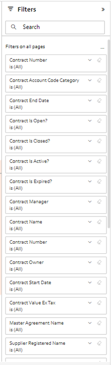
Within the dashboards themselves, there have been filters added that are designed to be the most relevant for the page that you are viewing. For example, in the Contract Renewals Management tab, there are filters for Options/Rights of Renewal Classification and Days until contract expiry.
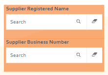
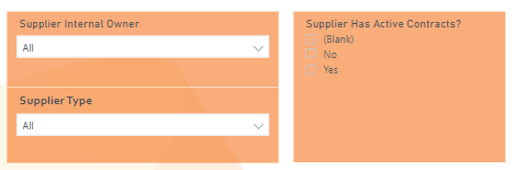
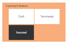
The filters within the dashboards will take one of four primary forms: typed, dropdown, tick box and tiles.
The typed option is primarily used to filter by a specific Supplier or Contract to provide the overview of the information shown on the dashboard for that supplier or contract, instead of having to extract all the information by reading through the supplier or contract record.
The dropdown and tick box filters work in a similar fashion and allow you to select multiple options to enable filtering with a filter A or filter B scenario.
The tile filter is typically used in scenarios where there are few options to select and it would be beneficial to have a clearer view of the options available and which filter specifically is being assigned. Unlike the two previous filters, this can only have one field selected at a time.
In any of the above examples, filtering by blank or "not set" can be a useful tool to find records without the required information.
There is another method of filtering that you can utilise within these dashboards which does not require the filter pane or a specific filter on the page. By selecting data in any visual within the dashboard, the visual becomes filtered automatically, based on the portion of data selected.
For example, you can see in the image below that the dashboard is reporting to have data for 13 suppliers that hold insurance.
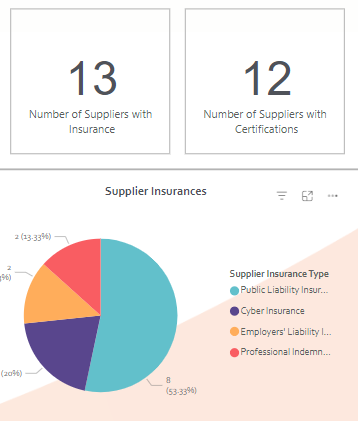
If you select the segment of the pie chart below to specific a particular type of insurance (In this case, Public Liability Insurance), the graphics and page around that visual will update to be filtered by that type of insurance also.
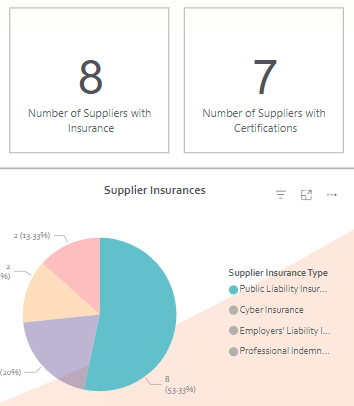
Selecting the same segment again will reset the filters.